


Inspiration
Using colours in interior design
Spring has arrived and, with it, colour! March 21st is International Colour Day, celebrating something that is a key factor in our day-to-day lives.
With the arrival of spring, everything around us is transformed and filled with colour. Colour is an essential factor in everyday life. It affects our wellbeing, shopping decisions, relations with others, energy levels, and what we convey through the clothes we wear. Needless to say, it also influences our living spaces.
That is why it is important to choose the right colours for the home. Each colour has its own significance. Are you aware of the impact that colours have on your home and on your state of mind?
Vitality: yellows and oranges
Both these colours have a similar effect. They represent the colour of the sun, life and heat.
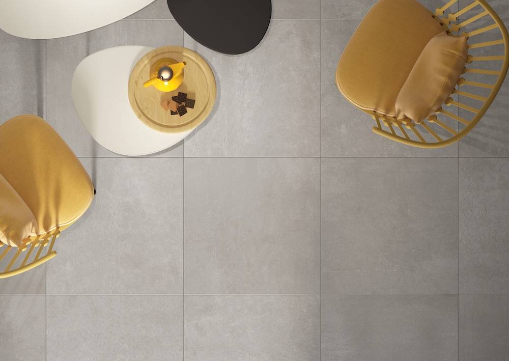
- These colours represent light. They transmit a sensation of vitality and good cheer. - They ward off the cold with their comforting feel. - They keep us alert. Normally we use these colours to highlight things of importance, and so they stimulate mental activity. Careful (-)
What do they bring us? (+)
So…
- These coloursshould be used in offices and other work settings.
- They also stimulate the appetite andspeed up your circulation and so they are often used in restaurants.
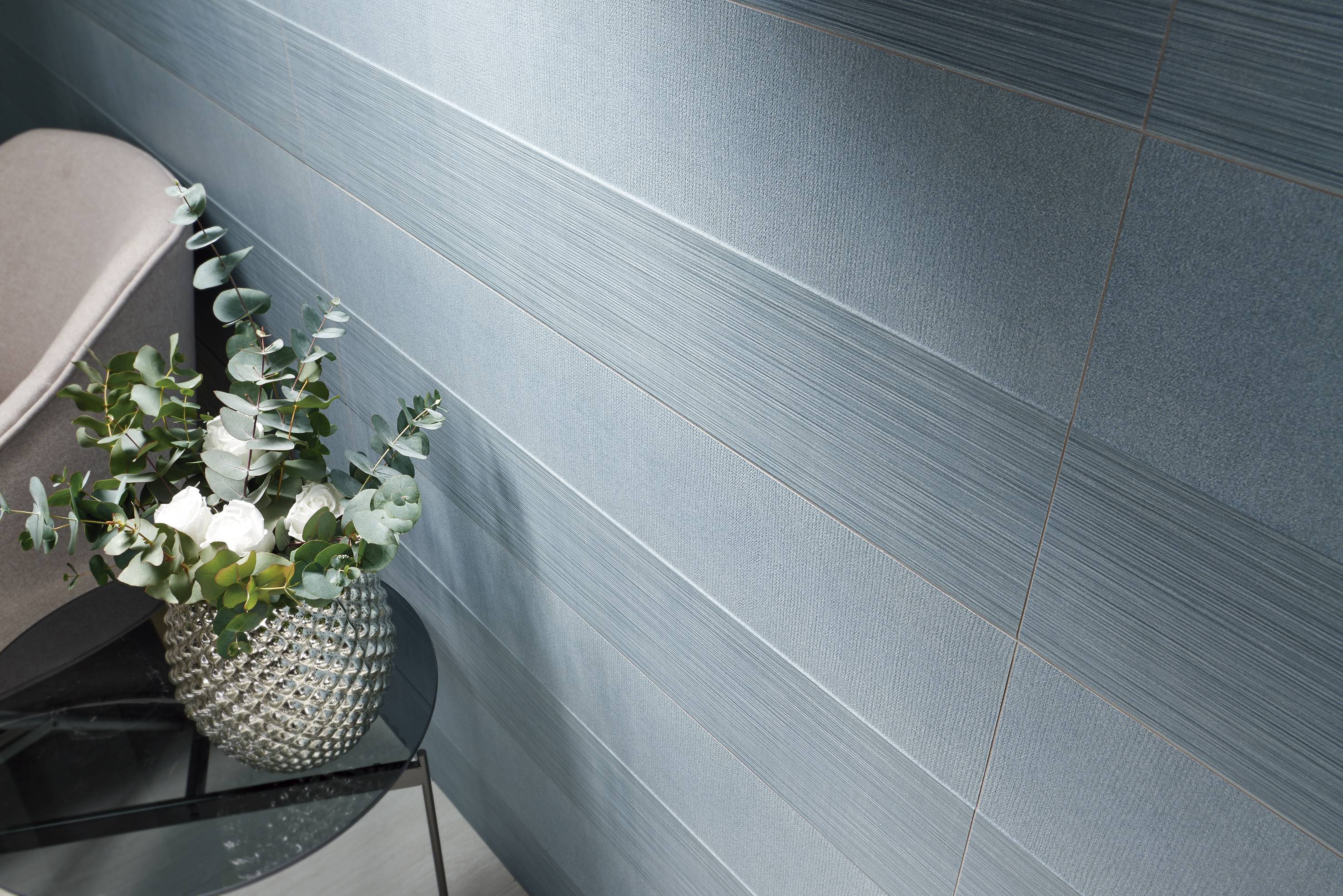
Los azules
Aquí llegan los colores relacionados con el mar.
What do they bring us? (+)
- Is thereanything more restful than a calm sea? Just as it isrestful to gaze at the horizon, winding down in a room decorated in blue alsoclears the mind.
- Blue is equatedwith stability and balance. It conveys a sensation of confidence and assurance.
Careful (-)
- Likeeverything, it has its flipside. Too much introspection can lead to depression.
So…
- Because this isa harmoniouscolour, it is often found in offices and waiting rooms.
- It is alsoassociated with cleanliness,and so it is common to find it in bathrooms and toilets.
Fun-filled green
Green isa symbol of life, like the pigment chlorophyll in the natural world, whichabsorbs sunlight and transforms it into nutrients for plants.
What does it bring us? (+)
- If you want tounderstand the significance of a colour, just think about nature. Green issynonymous with life and freshness.
- When we thinkof nature, we think of peace.
- It is also adynamic colour, evoking movement anddynamism.
The downside (-)
- Despite its versatilityin rooms, it is not easy to combine with other colours.
So…
- It is commonly used in projects for the contract market: in hotel receptions, restaurants and offices as ithelps people to adapt to new settings.
Pasión: todo al rojo
Representa la pasión, la fuerza.
What does it bring us? (+)
- Red is the most intensecolour. It represents passion and strength.
- Just by lookingat it, red has the capacity to rouse all five senses, to raise people’s bloodpressure and to improve their breathing. Red compels us to take action.
The downside (-)
- Too much redcan cause anxiety. Can you imagine sleeping in a room where everything is red?
-So…
- Knowing thatred can have such an impact, it is better to use it in small doses, forinstance fordecorative features.
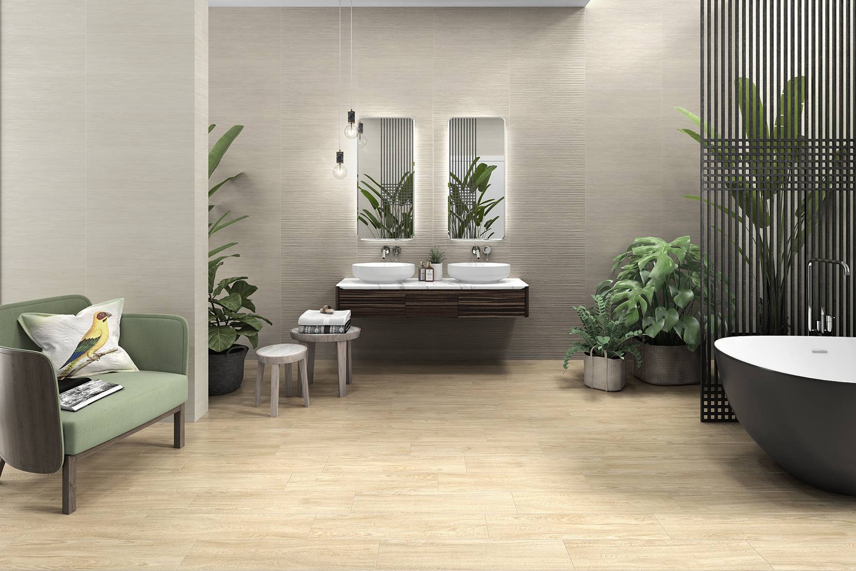
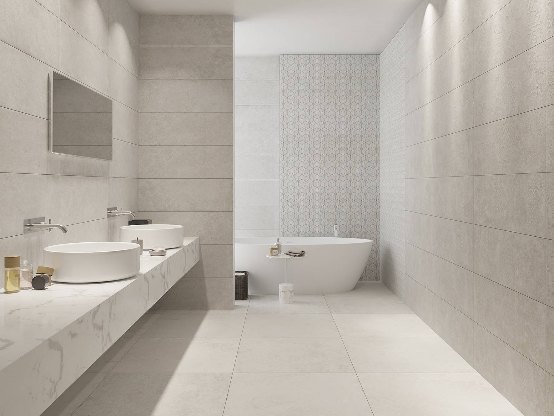
Neutrality: white
What does it bring us? (+)
- White tends tohave positive connotations. It is associated with purity, light and freshness.It is thought to purify the mind, to generate a feeling of peace and to conveya sense of wellbeing.
- In interiordesign, one good option is to use plain neutral colours and then to takeadvantage of fabrics and furnishings to add a more personal touch to rooms.
The downside (-)
- Althoughtotally white surfaces transmit a sensation of cleanliness, caring for one isfar harder than caring for a cream or pale-coloured one.
So…
- Because this isa basic in interior design, it can be used in any living space to add a calmnote, from bathrooms and kitchens to living rooms and bedrooms.
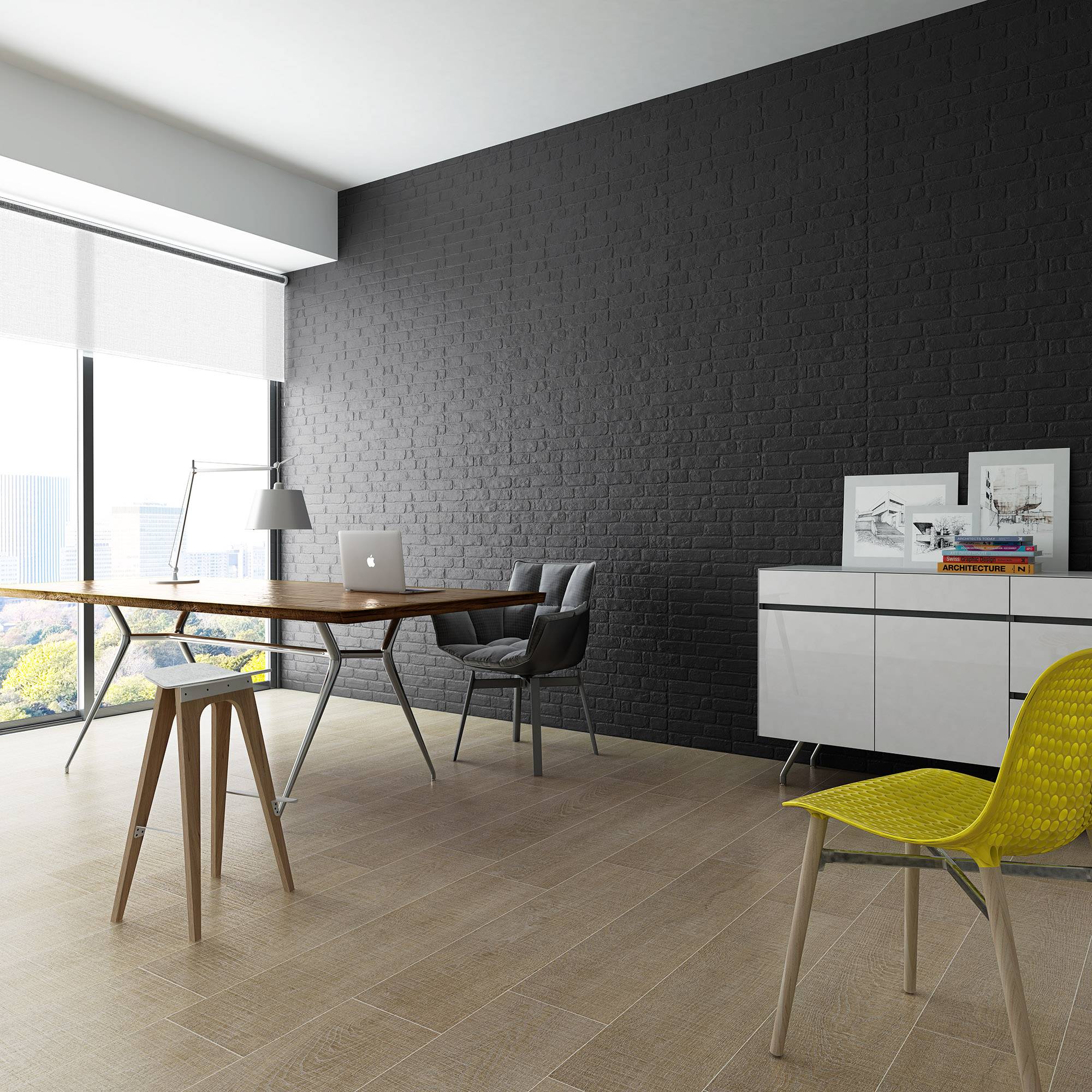
The elegance of black
What does it bring us? (+)
- Solidity,sobriety, elegance–all these qualities are associated with black, another basiccolour in interior design. It represents power, sophistication and superiority.
- Don’t you lovecontrasts? Black can be used in multiple different combinations witheye-catching effects.
The downside (-)
- Use it withmoderation. Don’t intimidate your guests.
So…
- Getting itright with black means not going over the top. In homes, use it for more minordetails to achieve living spaces with a comforting feel.
Bearing in mind the different feelings that colours can inspire, theycan be used to modify our state of mind and, by extension, to achieve ourgoals.


