


Inspiration
Which Pantone colours will set the tone for 2019?
Dress up your home in the design world’s latest trendsetting colours
When the year comes to a close, one question always pops into designers’ minds, as is the case now. “Which Pantone colours will set the tone in 2019?” The American Pantone Color Institute, which publishes a periodical report on the subject, has issued its opinion. The colours proposed by this international authority for next year’s spring/summer collections are bright strong ones, able to “inspire confidence” and “comfort the spirit”, to use their own words.
More specifically, the Pantone Fashion Color Trend Report cites 12 main colours, conspicuous on this occasion for their force and energy. It also lists 4 neutral colours, perfect for creating colour combinations with subtler contrasts. You may already have seen many of them on the catwalk, although their influence extends to other fields of design, including, needless to say, interior design. Join us in using these colours to dress up living spaces.
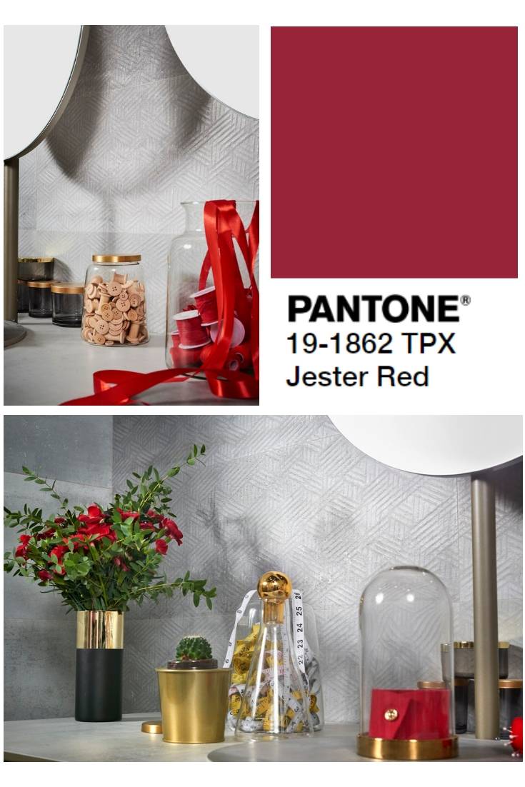
Jester Red, one of the main set of colours chosen by Pantone this year, is a deep red synonymous with passion. At the last edition of Cersaie 2018, the world’s biggest bathroom and ceramic tile event, the ARC collection by Metropol was showcased in conjunction with decorative features with a splash of dark red, since settings with an oxidized industrial look can be brought to life with this kind of contrast. Added charm can be lent to grey wall and floor tiles when they are combined with small items of furniture, floral decorations and different fabrics. In this way, the room can be revamped, when required, without having to change its essential components.
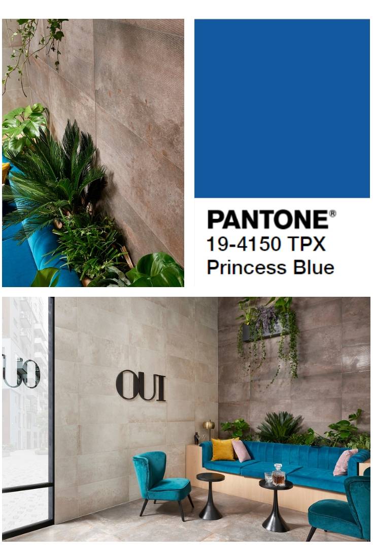
‘Princess Blue’–a colour whose name conjures up the idea of delicacy, although in reality it is a very solid blue–can be used in similar style. With the Rue de Paris collection by Keraben, an industrial setting has once again been combined to perfection with certain touches of blue. One of the keys to Rue de Paris is the fact that sheet metal, cement and slate have all been fused in one single collection. Added force is achieved by the oxidized copper effect and, to break away from all that neutrality, vibrant interplay is sparked off with the furniture’s ‘Princess Blue’ upholstery.
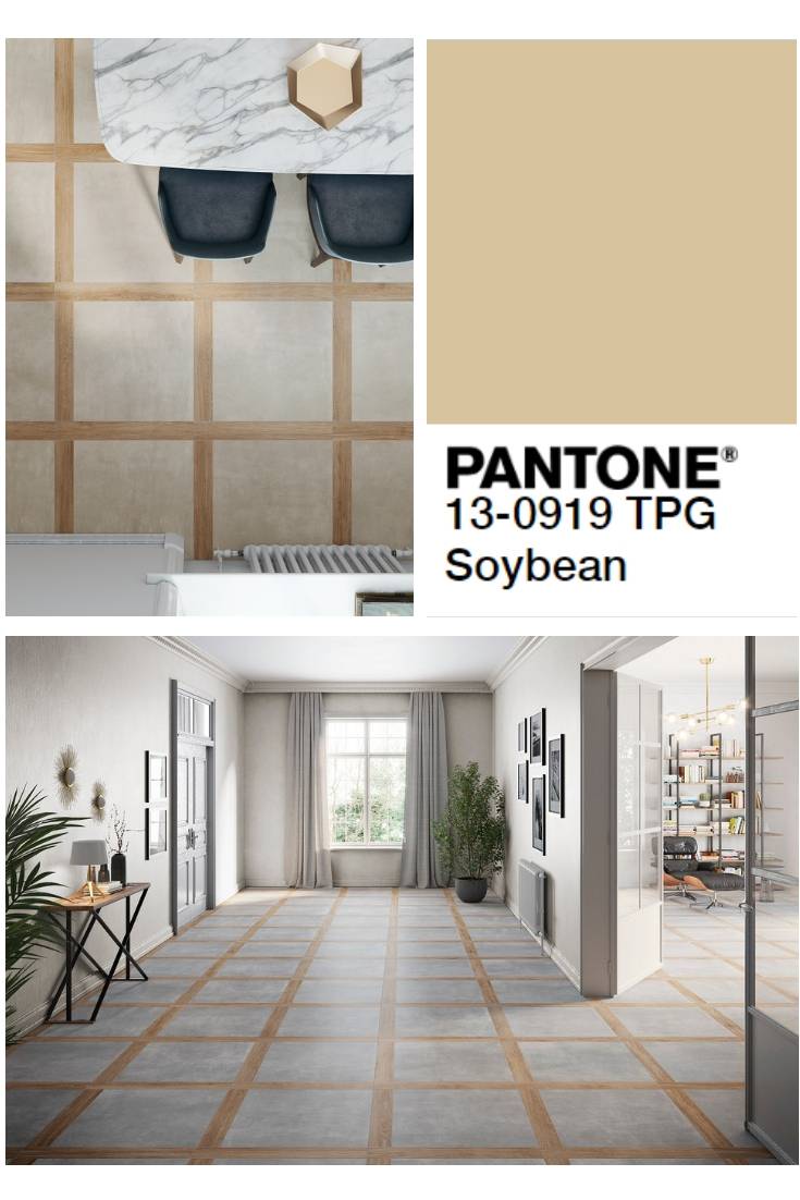
It is essential to know how to combine this set of main colours with other neutral shades so as to ensure a balanced effect, although interplay between neutral colours can also be used. This is demonstrated with 'Soybean' (a kind of beige) and 'Brown Granite' (a timeless shade of brown). In the setting featuring the Cadord collection by Keraben, Soybean has been used to create a restful elegant atmosphere in combination with the industrial grey wall and floor tiles: a style perfect for reception areas, for instance.
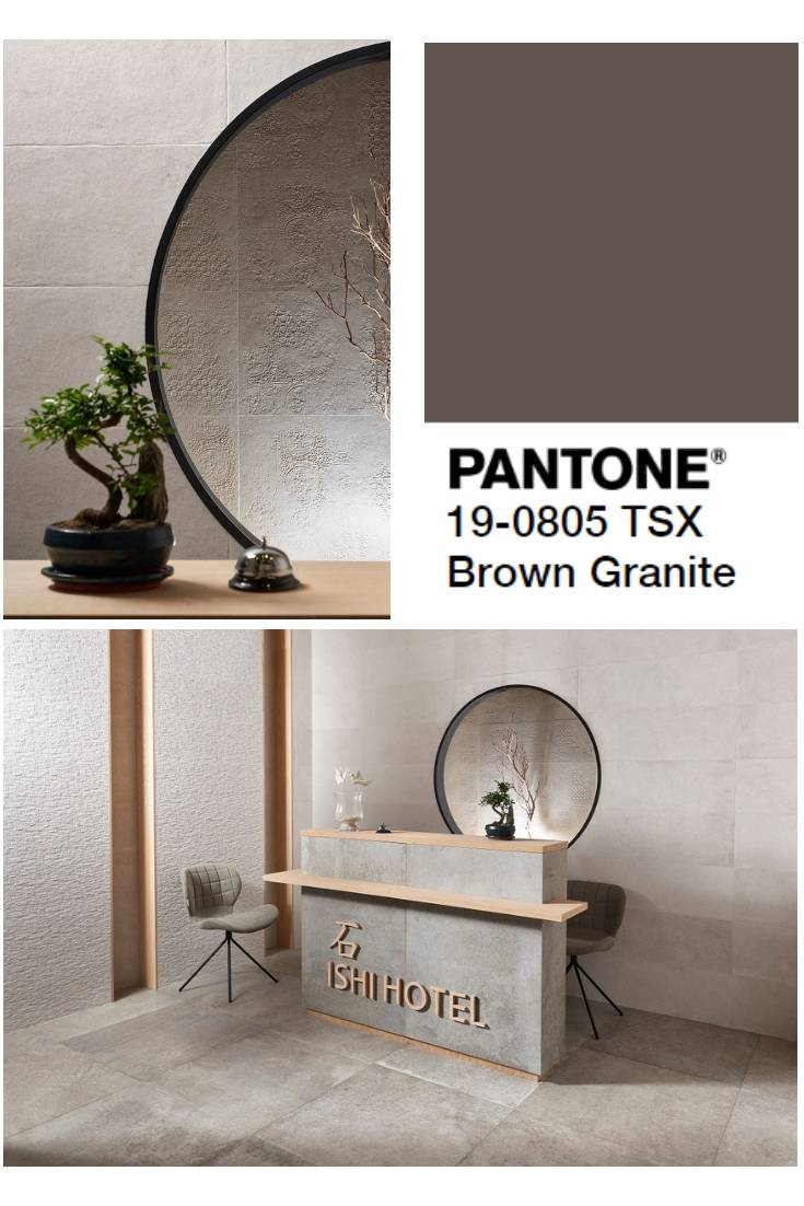
For its part, the Camelot collection by Casainfinita shows how beige and dark brown can be combined against a greyish backdrop, without any of these colours prevailing over the others.
In short, these Pantone colours will set the fashion in home design from now on. Our timeless tile collections can be used to create the perfect background settings for the latest spiritual, intense, stimulating Pantone colours.

