Somewhere over the rainbow: colour
The scenes that take place in your house have a main character: colour. We want to offer you some recommendations for how you can work with this character. But we also invite you to challenge it to adapt to your daily life. Rules exist to be broken
Colour is an important part of life. We often forget the profound influence that it has on our state of mind. Vivid tones cheer us up, but a dark room can turn us off. That's why it's so important that we choose the shades that surround us carefully. From our clothes to the objects that keep us company. In particular, the colours that we use to decorate our houses, as this is where we spend most of our time. And how can we make sure that we get it right?
Interior design has a catalogue of colour schemes that are on trend for each season. In this world, one of the most authoritative voices is the Pantone Institute. However, beyond these guidelines, there is one thing that should be evident from the appearance of your home: your personality. If you are thinking of renovating your home, or perhaps updating a room, we would like to offer you some colour recommendations. And, at the same time, we also invite you to challenge them.
Here are the colour trends for your home for this autumn-winter season. And here are some tips that will allow you to personalise them a little more. Nothing is more fashionable than letting go, getting inspired, and incorporating our travels and memories. Nothing is more elegant than freedom.
1. Combine and conquer
THE GUIDELINE: Interior designers are increasingly advocating colour palettes that interact and that mix together to create stimulation. This requires neutral, flat tones to start with. These are then enriched by other, more intense, textured tones - so get ready to combine tones without worrying.
THE CHALLENGE: Think of your favourite colours, those that make you feel good when you come home. Then, keeping them in mind, let yourself go: incorporating some trendy colours to update them.

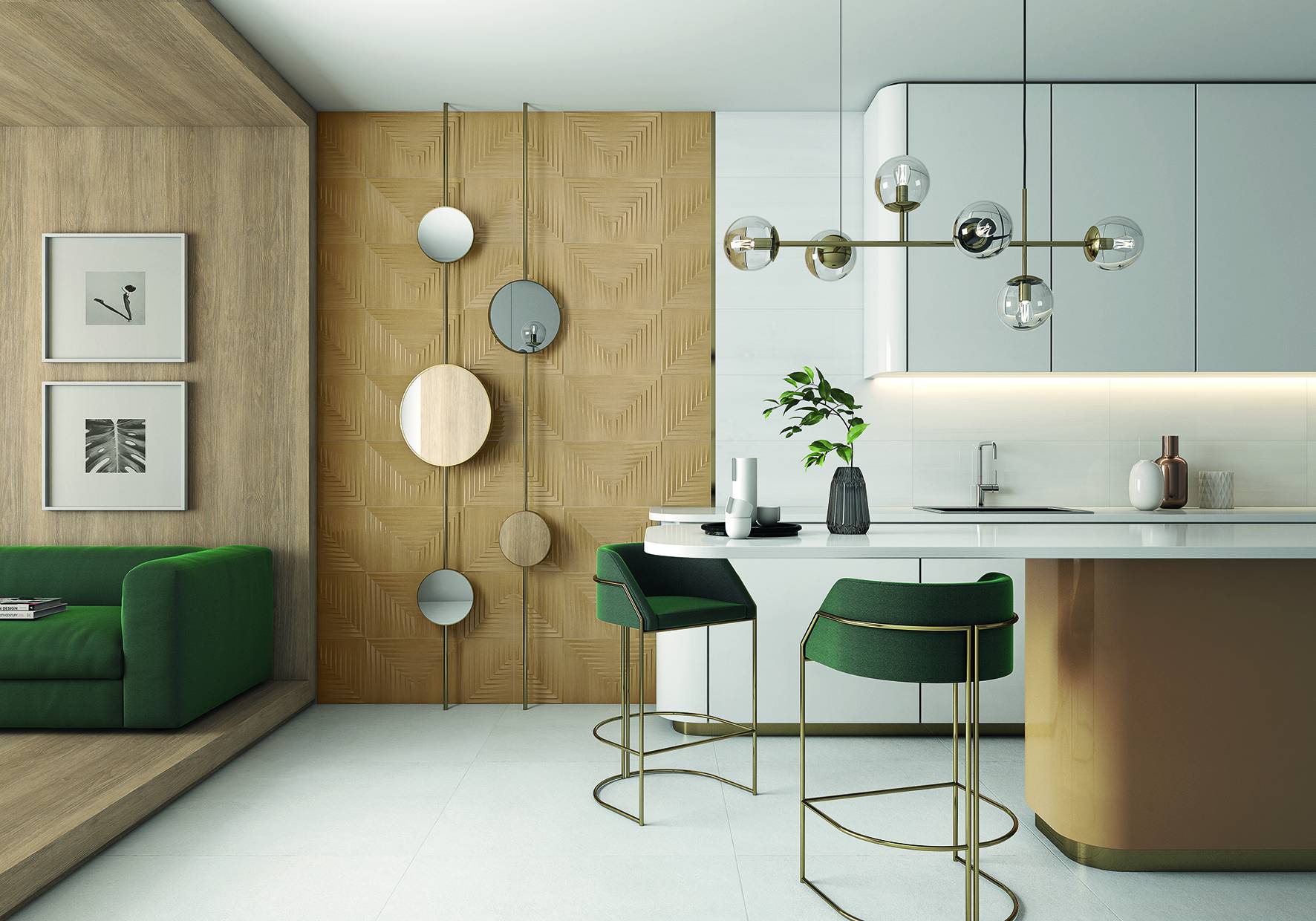
Collection, by Metropol. Inspired by ArtDeco, it combines past and present, nature and sophistication. There arecalming colours, such as mustard, and others that are much brighter, such ascoral
2. Facing the wall
THE GUIDELINE: When you want to rejuvenate a house's appearance quickly and effectively, the best thing to do is to focus on the walls, making their surface ever more daring. Choose the colour of large areas carefully, using exaggerated shapes and marked textures.
THE CHALLENGE: First question: what do you want to achieve? A geometric area can be disguised with a soft tone, or alternatively, it can be made to stand out by using a more garish one. Choose colours that achieve your aim.
3. Nature rules
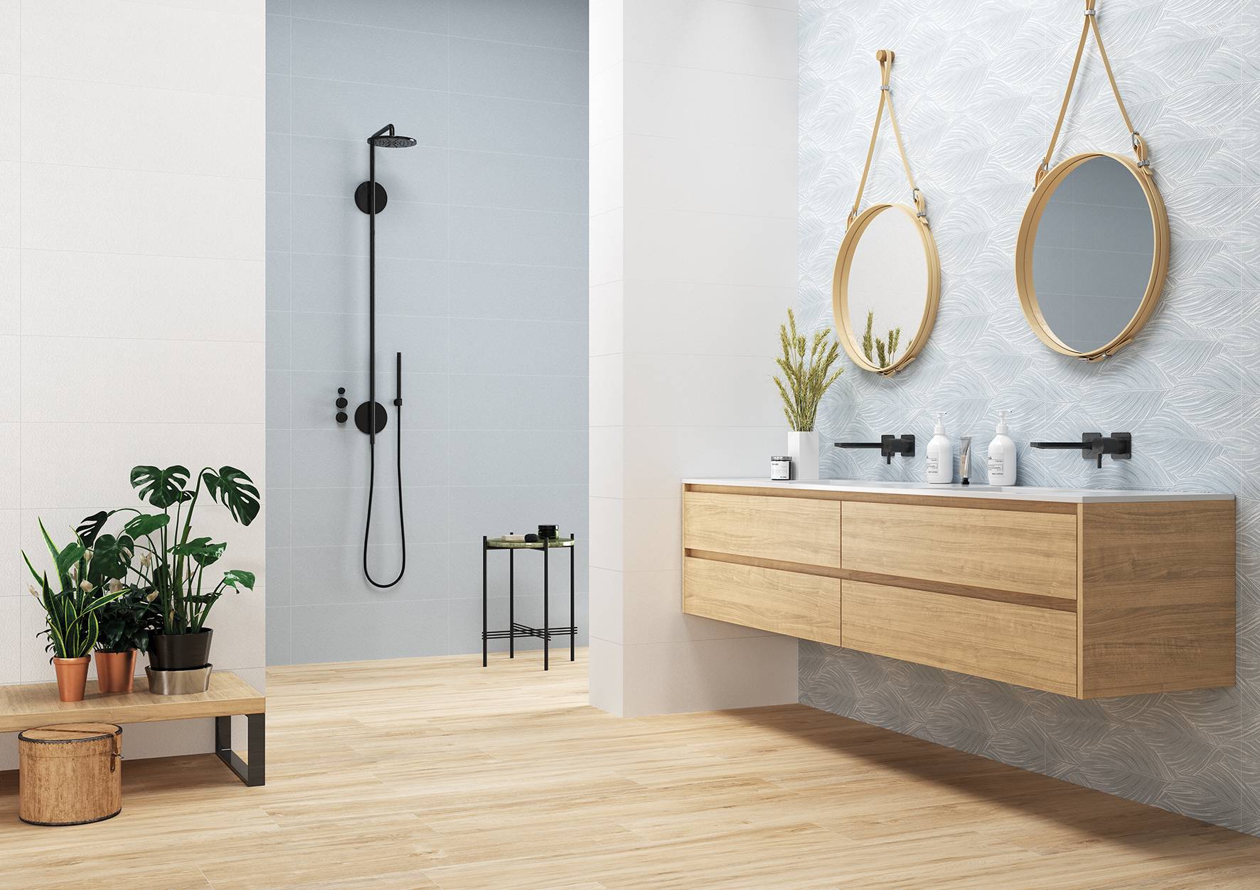
THE GUIDELINE: Nothing can conquer natural forces, so decoration must always give in to them in the end. This season, greens and blues prevail, along with designs that are reminiscent of leaves on trees and the waves in the sea, blending the exterior with the interior.
THE CHALLENGE: If you are ready to recreate your favourite landscapes, try to allow them to inspire you in your daily life. If you need peace and quiet in your office, it's best to opt for soft, balanced colours.

Paradis Collection, by Casainfinita. Due to its variety of colours and soft shades, in addition to leaf and bubble shaped reliefs, it transports you to paradise and brings peace to rooms
4. Liberating multiculturalism
THE GUIDELINE: It is important to look outward in order to reach inward. This includes being open to other cultures. Let yourself be impacted by other places and enriched by other customs. Let the colours weave an ethnic network, from jungle greens to Nordic greys.
THE CHALLENGE: Let the house say something about you, your story, and your travels. Give in to exoticism that reflects your roots, your experiences and the person you are today in your rooms.
5. Make it shine
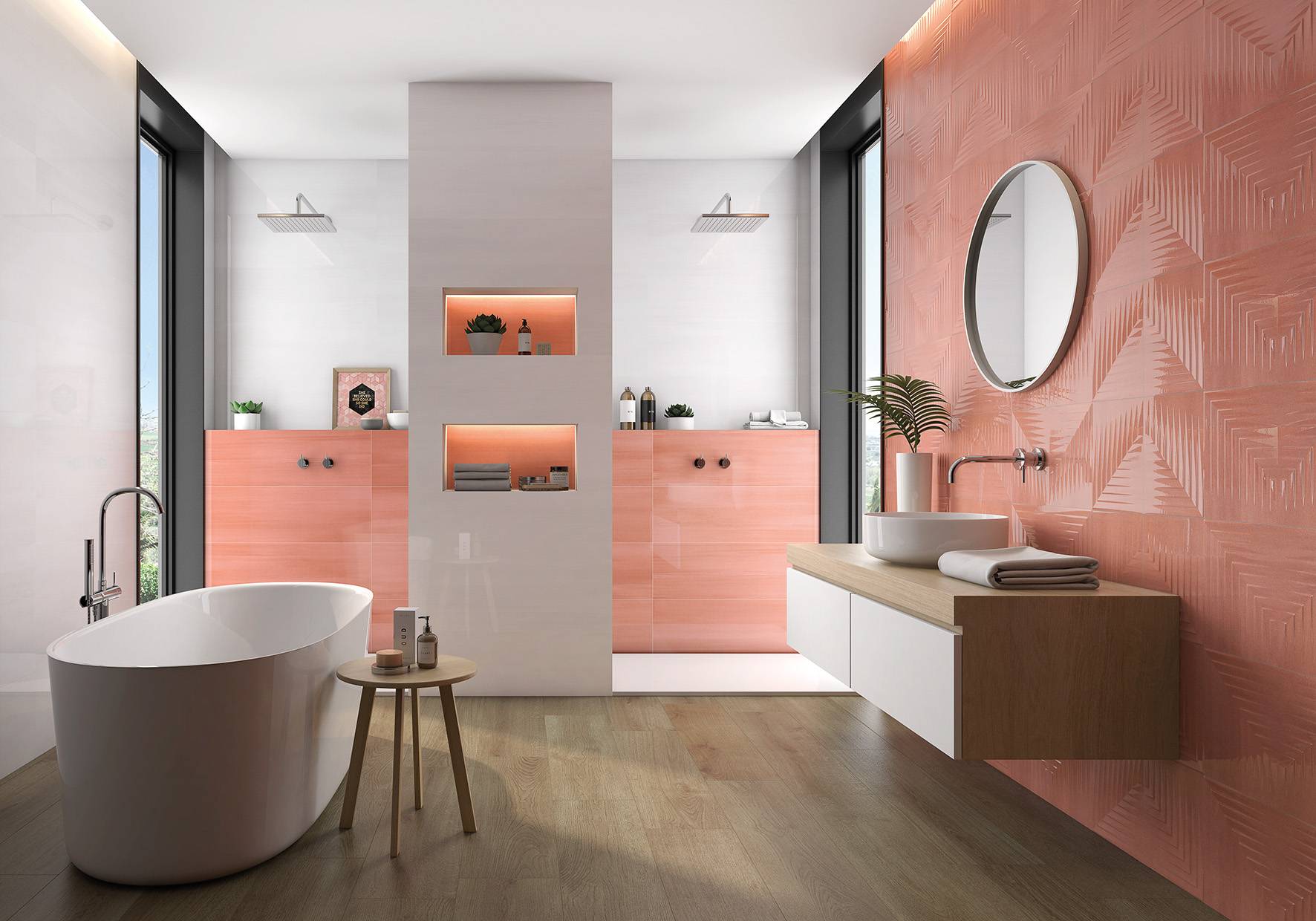
THE GUIDELINE: The time for all coatings to be matt is over. The new gloss finishes make it possible to count on luminosity and elegance. It's amazing how a colour or a decoration can be changed just by applying a layer of gloss.
THE CHALLENGE: You make your choice, and therefore, create a balance. It's time to get forget any worries about shine, whether for the whole room, or as a contrast. But the level of risk is up to you.

Metropol's Capitol collection boasts a much brighter supergloss finish. A new generation, which is much more luminous, and which makes a significant aesthetic change in rooms
In short…
There are as many colours as there are people, and as many ways of drawing as of understanding life. All trends in decoration are (must be) open to combination and reinterpretation. Fashion can help, but it is your job to create a home. Dare to be yourself.
The colour trends we have reviewed can be found in the ceramic collections that Keraben Group presented at Cersaie. During the prestigious event in Bologna, the company presented a reinterpretation of classic tales with an elegant, avant-garde aesthetic.
While Keraben was inspired by The Wizard of Oz, Metropol unveiled its new products using scenes from Alice in Wonderland. Its Capitol collection, inspired by Art Deco, stands out, reviving plant motifs and merging the past with the present. CasaInfinita relied on Peter Pan and presented Paradis for the first time. This collection has a great variety of colours, and is rich in soft shades and natural reliefs


