UNE Farmacia, innovation and quality in a single space
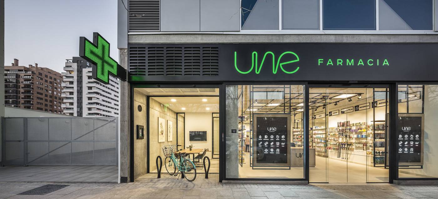
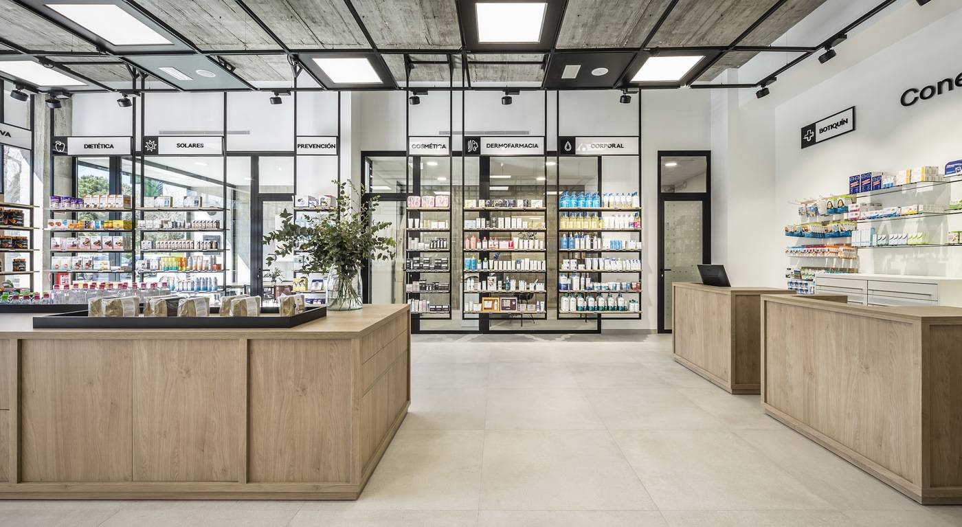
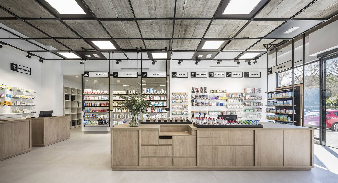
The fact that something is local and familiar does not mean it can’t be bold. UNE Farmacia is one of Grupo Keraben’s most recent projects, and amply demonstrates that this is possible. Can a pharmacy be bold and innovative? It most certainly can. UNE Farmacia, one of the most recent projects of Keraben Grupo and Destudio Arquitectura, is the living proof that an establishment dedicated to health does not have to be dull or dreary. Quite the opposite, in fact. The fact is that if there is one thing that characterizes this unusual pharmacy it is its space, as warm and welcoming as it is convenient and aesthetically attractive. In addition, customers’ trust and confidence is achieved thanks to its airy, open-plan spaces with plenty of natural light and minimal architectural barriers. A project with these specifications needs some very specific materials, given that otherwise it would not be possible to achieve the desired effect. Hence the core structure of UNE Farmacia was based on glass and black lacquered iron, combined with wood and exposed concrete. Overall, these materials were used to configure an area of 164 m2 in which purity, cleanliness and harmony are the main characteristics.


The flooring was sourced from the Solid collection from IberoCasainfinita in Beige, with a tile format of 90x90, which embodies all the characteristics of cement and the austerity of industrial style. However, the softness of its design makes this a versatile and elegant proposition, blending perfectly with any kind of decorative style. And it’s not just the interior space that makes a difference: the outside is noteworthy too. In the case of UNE Farmacia, the façade is one of its strengths, being completely open to passers-by, leaving the inside space on view from outside. You can even see the area set aside for meetings, in a strongly transparent approach that makes the pharmacy itself a showcase. Meanwhile, two LED screens welcome customers at the door and help to highlight the messages the pharmacy wants to transmit, taking full advantage of the benefits of the latest technologies. When it came to the lighting of UNE Farmacia, both Keraben Grupo and Destudio Arquitectura wanted to minimize artificiality and embrace natural lighting, which helps to instil greater trust in customers. The design thus maximized natural light through large windows that allow the outside light to flood in. The artificial lighting, as a secondary option, consists of general system of 60 x 60 cm hanging LED screens plus specific product lighting by directional LED spotlights. The traditional pharmacy, often seen as cold and impersonal, is now relegated to the past. Today, spaces like UNE Farmacia, which beautifully combine design and innovation, are setting the bar for other establishments to emulate to become more than just a transient space. Entering this pharmacy means entering a dimension that offers the best of familiarity, approachability, originality and design. Because, without a doubt, it is the soul of establishments that attracts customers and cements their loyalty.

Photography: Germán Cabo.
Architect: Destudio.
Destudio is an architecture, design, construction and interior design studio formed by a multidisciplinary team of professionals who undertake residential, pharmaceutical, retail and office projects, among other specialist areas, in different cities. Destudio approaches its architectural projects from a sense of commitment not only to aesthetics and functionality but also to sustainability and economy. This is achieved by comprehensive project management right from the start of the design phase, taking care of the entire process through to the final delivery of the work.


